Yes, Title safe still matters – especially for online video
Title safe, action safe, safe margins, safe area, safeties – whatever you want to call them, they matter. Some people forget about them (from shooting all the way through edit) and a surprising number of folks don’t even know about them.
Whether you’re a client, producer, camera op, editor, graphic artist, or just some dude who likes to watch videos, you should be aware of safe margins.
As a video content creator ignoring title safe could mean a whole lot of viewers aren’t seeing text or other vital information in your videos.
What Are Safe Margins?
Back in the day TVs used CRTs (cathode ray tubes) to project an image onto the screen. Due to manufacturing differences between televisions and the CRT magnets degrading over time, some of the image would be cropped at the edges.
To combat this image cropping the SMTPE (Society of Motion Picture & Television Engineers) got together and created title safe and action safe. These are areas on the screen where all text and important action should be kept within to ensure the information is not cropped by the viewers display.
These safe areas are 80% of the screen for title safe and 90% for action safe.
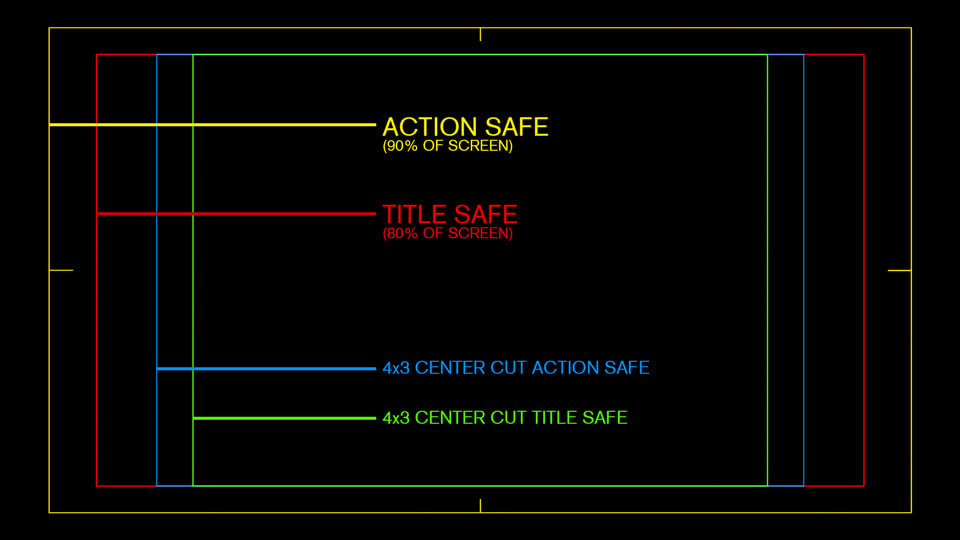
A few years back the SMTPE updated the safe areas for HDTV. The new safe areas crop much less of the screen than the safe margins of old. The new areas are 90% for title safe and 93% for action safe.
These updated margins are not in wide use, but are occasionally used as guides for network bugs (the logo in the corner) and lower thirds.
As you will see below the newer guides shouldn’t be used if your video will receive heavy viewing on mobile devices… Unless you don’t care that some viewers won’t see your text.
Why do safe margins still matter?
4×3 center cut safe
Many broadcasters still require “center cut safe.” This ensures that people who still have old 4×3 TVs won’t have the text cut off on the sides. If you don’t adhere to the safe areas your video will not pass quality control.
I have had some projects where the client didn’t care about 4×3 safe margins. In those instances the media buyer needed to call the cable and broadcast outlets and ask them to make an exception for our ads, which had graphics out of the 4×3 safe areas.
In most cases you can ignore center cut safe, but it is best to find out ahead of time.
HD and 4K Televisions still have overscan
You might think that since most people have flat panel displays we wouldn’t need title safe anymore. Unfortunately most HD and 4K TVs still have overscan, which results in the edges of the image being cropped.
On many TV models overscan can be disabled, but is turned on by default. Most people don’t turn off the overscan on their TV because they are unaware of it. This is why most video games have you adjust the display area on your TV when first launching them.
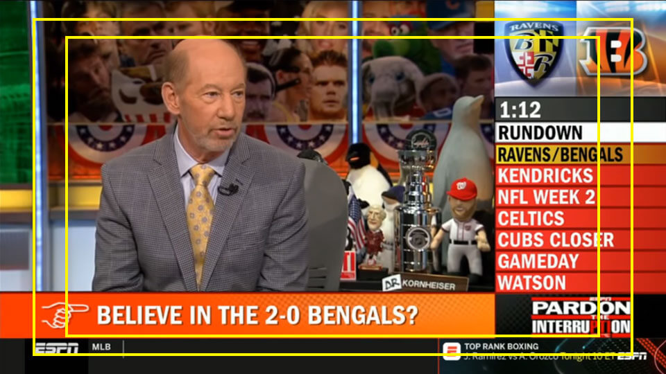
Why Safe title matters for online video
Online video has kind of had an “anything goes” mentality. We have all seen the social media videos that have subtitles right at the bottom margin of the video frame. Many folks only adhere to safe margins for aesthetic reasons, or because their video was for broadcast/cable as well as the internet. Some online videos don’t bother with safe areas at all.
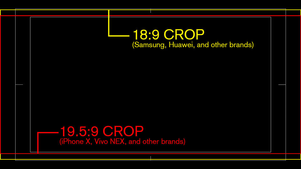
Not All Phones have a 16:9 Aspect Ratio
Phones like the Google pixel, Samsung Galaxy, iphone 13 and many others do not have a 16:9 aspect ratio.
The new iphones have a 19.5:9 aspect ratio. Google, Samsung, Huawei and many others are using 18:9 aspect ratio (I wish they just called it 2:1). While some other brands are using 18.5:9 and 19.39:9
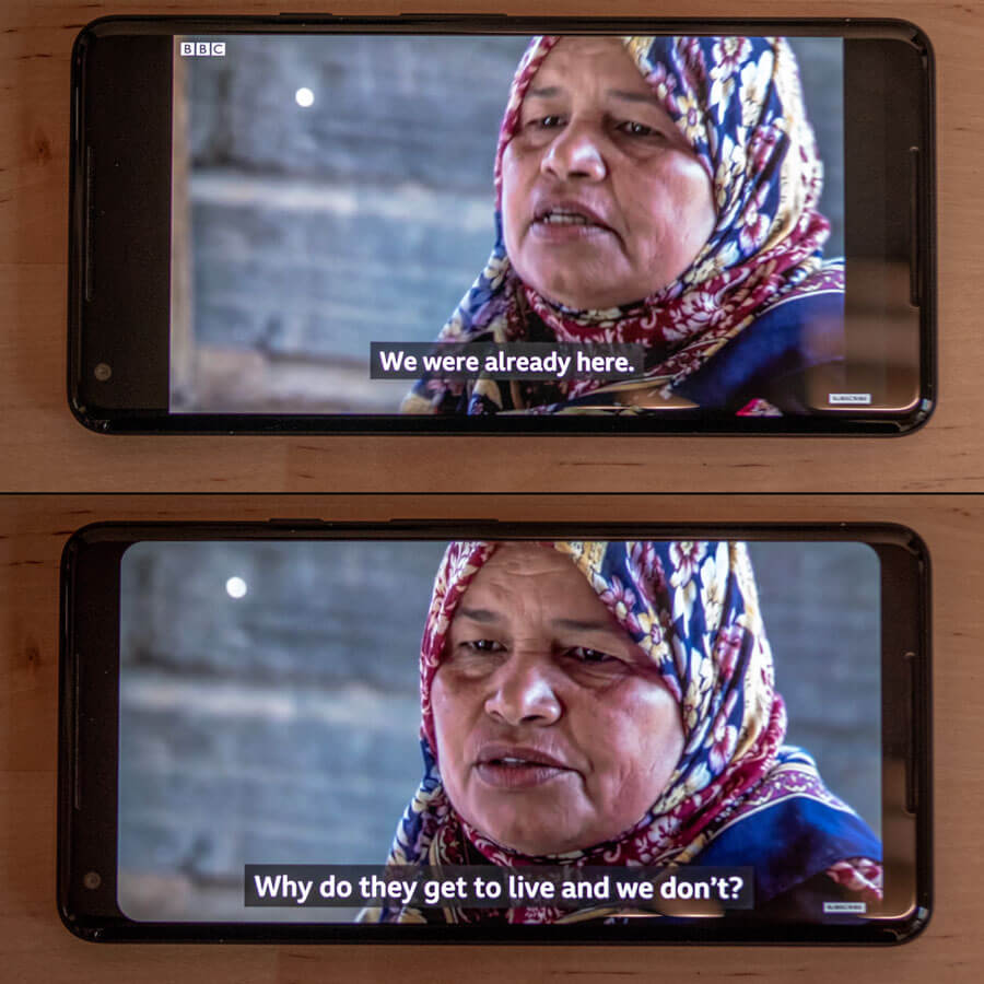
New Phones have a “Zoom to full screen” Feature which Crops Video
All of the new phones have the ability to zoom video so it is displayed full screen. This zoom crops the top and bottom of the image. Some devices have this zoom set by default, which means many users are probably not even aware of it. Other users actively enable the full screen mode.
A quick search in online forums will show that many users prefer to play video full screen on their phones, resulting in cropped video. They would rather use the entire screen of their device than view your entire video.
Why Should You Care About Phones Cropping Your Video?
Imagine that you are working on a 15 second pre-roll ad (the ones you can’t skip) that will play exclusively on youtube, Hulu, etc. If you created lower third graphics to fit within the revised HD 16×9 title safe area (90% of the screen) your text would appear cropped to anyone viewing the video full screen on an iphone, Samsung Galaxy, Google Pixel, or other device with a 19:5 or 18:9 aspect ratio.
Needless to say the client would not be happy with this situation – especially if they’re the person watching the cropped video.
The safest bet for Title safety
As video creators we need to take the image crop of new phones into account when creating text for our videos.
With so many aspect ratios to worry about it’s not practical to accommodate everyone, but you can ensure that the vast majority of people will see your text graphics in all their glory.
Currently the safest bet is to put all critical information within the “old school” title safe area, which is 80% of a 16×9 screen. I think for the most part (and certainly for web videos) we can do away with 4×3 center cut safe.
The good news is that most editing and graphics software still use the 80% value when displaying title safe, and most people are already using this as a guide.
Sticking with 80% title safe area will keep your text within the crop area on all current phones when they are viewed in full screen mode.
A trickier question is what to do about action safe. If you have any suggestions please share them in the comments below.

Thanks so much for an informative article! I worked as a graphic designer in television for 20 years — exiting the industry in 1999 — and was wondering if “TV-safe” was still an issue. Your article tells me that it’s more important than ever.
Hey Dan, thanks for the comment. I’m glad you found the article helpful. Please visit the site again soon, I have more content coming
One thing I was curious about is how much a video designer should consider the way the UI of a video player service might interfere with a video. i.e. Vimeo’s player bar obscuring some of the screen for a few seconds anytime the mouse interacts with the player space.
Hi Megan, thanks for the comment. I would definitely take the UI into account when designing any text elements, or even shooting your video. The good news is that for the most part, online video players keep their play buttons, timelines, etc. outside of the 20% title safe area. As long as you keep your important elements within that you should be fine.
Some apps on smart TVs and game consoles do have additional overlays when a video is paused, or first begins playing, but it isn’t realistic to account for every possible variation of UI – especially when they will only be up for very brief periods of time, or during special circumstances. ie. when a video is paused of fast forwarded.
After reading this, I fiddled around with the ESPN, YouTube, and Hulu apps on my iPhone X. Interestingly, none of them contained an obvious ability to full-screen/crop the video; they all displayed video full-frame only. Android versions of these apps may differ, but it seems as though the issue of cropping may have been resolved.
hi Brian, thanks for the comment. I checked the youtube app on my android phone and my wife’s iPhone X – the pinch to zoom functionality for fullscreen video was working fine for me on both devices. (on the iPhone this places video in the “notch area”).
I did a quick internet search and it seems like some folks needed to reinstall youtube after a recent update to restore the pinch to zoom fullscreen capability.
The good news is that this is a setting that most viewers need to actively choose, but there does seem to be a rather vocal group that prefer to watch videos this way.
I personally don’t have access to any of the phone devices that have the fullscreen on by default, but if I come across one, I will definitely check it out, and update with my findings.
I am getting ready to finalize my first film, and just discovered the issue of TVs cropping the video. So… I’m currently adjusting some text in the bonus features. From a design and aesthetics standpoint, though, how can I arrange everything to look the most pleasing to the eye (rule of thirds, spacing relative to the edge, etc.) if I need to account for the safe space? I’m pushing a deadline, so I’m just doing the best I can, but some of the text doesn’t look as good uncropped anymore.
Do I arrange everything as though the full video would be seen, but let the safe space trump aesthetics when required?
Hi Christina,
Thanks for the comment and congrats on finishing your film! That is a huge undertaking.
What is the aspect ratio of your film? The teaser video I saw on your website looks like 16×9 – I think you should be fine keeping everything within 16×9 title safe. You can cheat it a little bit and go to action safe if you think it is necessary, but understand that folks viewing on an 18×9 phone might not see some of the elements if they have the video in “full-screen-mode.” Anyone with a TV set up for overscan will will lose 4% of the screen at most (about halfway between action safe and the screen edge)
The aesthetic choices are entirely up to you. I would still base my design on the full screen area, but try to keep essential text and images within safe area – you can use the rule of thirds and still be well within safe areas in most cases. I think you will find that it is extremely rare that you would want to place any vitally important text or visuals right at the edge of the screen for aesthetic reasons. Don’t let the safe areas stop your design decisions if it is something you feel really strongly about for artistic reasons.
I hope that helps… and good luck with the launch of your film!
A production house developed lower thirds for our company that are so large that when captioning while the lower third ID is shown, the editors resort to showing the captions at the top of the screen and then slide them to the bottom after the lower third is removed. I think this looks awful. What size lower third and omni-present bug do you recommend composing in After Effects. Our video is all destined for our website and social media not broadcast media; and we want open captions burned in the videos.Thanks for any suggestions
For the social media videos – a common thing is to output a 16×9 video in a square aspect ratio with black bars on top and bottom, or one large bar at the bottom – then you can place all of your captions in this area outside of the video. This will allow you to make the text of the captions much larger than if they are traditional captions over the footage. You can also place your bug in this area if you wanted.
If you’re going to have the lower thirds, bug and captions all up at the same time, Ideally the layout for all of those elements should be designed at the same time to ensure that they work together. You can move your bug and lower third closer to action safe – just understand that on some phones those elements might be cut off for certain viewers. I would actually recommend to place the captions in the area that might get cut off, if that works.
Great article, thanks! Is there anyway you have the graphic in a PNG alpha format?
Thanks, I am glad you found value in the article. I am not able to find the original image to make a png of the title safe graphic.
I’ve been working with Twitch & have yet to ever see the need for using title safe & action safe zones. They appear to use chat and other twitch UI + not _actually_ filling the entire phone screen in order to ensure you get the entire published screen. Do you have any thoughts or experiences if streaming only to Twitch regarding safe zones?
I don’t really have any experience with twitch. There are overlays that display during ads which let the viewer know that an ad will end soon, so if you are uploading an ad you should factor those in. I’m not familiar enough with the other content on twitch, so I can’t really give an informed opinion on it.
Any recommendations for corner placement of a Picture-in-picture? Tempting just to put it in the very corner of the frame for online video, but not sure that’s best. Seems like the bottom should sit on the safe title line (for phone cropping/cutoff), but what about horizontally? All the way to outside edge of frame? Or left edge on 16:9 action safe? Thanks.
As long as the main portion of the small “Picture in picture” video is within title safe you should be fine with placing it in the corner. Just be mindful of where the final video will wind up. For example if it goes on youtube there could potentially be the channel watermark in the lower right portion of the screen, or the playback controls across the entire bottom if a viewer leaves their mouse cursor over it.
Thanks for this article and especially the overlay image of all the ratios. To know exactly what safe area I need for an iPhone with a 19.5:1 ratio, I today tested an iPhone 12 by playing a YouTube clip shot natively in 19.5:1…
https://www.youtube.com/watch?v=Go4a15GhK2k
…and found you cannot pinch to zoom to fill the screen with a native 19.5:1 video already taking up the screen. So I think it’s safe for me to consider that 19.5:1 needs no horizontal safe area. BUT I’ll be adding a vertical 90% safe area to the sides 1) to frame out that ugly iPhone notch, 2) to frame out the rounded iPhone corners, and 3) in case someone watches these clips on a TV that’s zoomed in.
Of course, I could push it to 2.2:1 in case phone makers keep competing in this one area. Seasons 3 & 4 of “Ozark” on Netflix was shot 2.2:1, so maybe they know the future.
Thanks for sharing. It’s getting harder and harder to keep up with all the different device aspect ratios
Hello, I ran into your site looking for a safe frame image to import into photoshop. What motivated me to write is that I had to create a comparisson diagram between SD video and FHD video sizes, I created a rectangle with FHD dimensions overlapped by a rectangle with SD dimensions. No surprise there. The SD rectangle is much smaller than the FHD. But then I imported your safe frame guide into photoshop to start designing and that’s when I got puzzled. The SD safe frame is just a little narrower than FHD, around 20% like you said. But in reality SD is way smaller than FHD. I went to the editing room and puzzled a fellow coworker with the same stuff. We did the experiment of inserting SD video on a FHD timeline and it looks way smaller, like the diagram I made. So why is it the 4:3 safe frames just a bit narrower on a FHD image on any video editing software? My logic tells me it has to do with something they do when broadcasting a FHD that will be received by an SD screen.
Hi Sergio, You are correct that SD is much smaller than HD video – about 1/6 the resolution. If I am understanding what you’re saying correctly, I think what you are seeing in photoshop is the difference in the number of pixels between SD and HD.
The title safe areas are using the aspect ratio of the video formats, not the number of pixels. The HD (16×9) aspect ratio is 33% wider than the SD (12×9) aspect ratio.
When HD video is played on an SD screen it isn’t a perfect pixel to pixel translation – the video is scaled down to vertically fit the SD screen, so only a small amount of information on the left and right are cropped from 16×9 to 12×9 aspect ratio. In your video editor you can replicate this by either scaling SD video up to fit vertically in an HD timeline, or scale HD video down to fit vertically on an SD timeline. Once the scaling is done, the safe guides will be accurate, but they will not reflect the actual size of the different video formats when measured in pixels.
I hope that helps.
One other thing to keep in mind… if you’re actually working with digital SD video, the pixels in some SD video formats are not square. I don’t remember the aspect ratio of the pixels, but you need to make sure that your software is compensating for this, and displaying the image correctly, otherwise everything will look slightly stretched. There used to be an option in photoshop to correct for non-square pixels… it’s probably still there, but you probably need to compensate for this when making your image size comparison in photoshop. If not, your SD frame’s aspect ratio won’t be 4×3 (12×9) when pasted into an HD image which has square pixels.
This article is very practical, reminding us of various details to pay attention to in video production. Well done!
Maybe it’s just because I’m related to you, but this is the first search result in google when I went to check if I was using the right title/action safe boundaries. Pretty sweet!
Glad you found it helpful Tom!
It’s also nice to know I’m still the top search result after all these years